Think big. It will give your brand more potential in the long run if you know the wider scope of the business.
Keep your business vision broad so that you can encompass the new setting if and when needed in the near future.
Winning the minds and hearts of clients with a distinctive logo can mean the gap between a company’s success and failure. A catchy logo may help customers connect with your brand and remember your company in the future. Identities are becoming less literal and more concerned with the emotional connection. Apple is an excellent example of a firm whose brand allows for product development since consumers appreciate what they stand for. It all begins with their logo. The Apple logo does not symbolize computers or technology, but rather what the firm represents: sleek, stylish items that are not cheap but are the finest in the market.
As we’ve already established, a logo is the face of your brand and the first impression your audience will get of your firm, thus logo design is critical. Good logos give their audience a simple mental shortcut to assist people immediately comprehend what a firm is about, but overly complicated designs are more difficult to build recognition with and rarely succeed. More than simply graphic design is required to create an effective visual representation of your brands. Logo design, like any other line of work that demands a specialized set of talents (you just read that like Liam Neeson, didn’t you? ), takes a lot of practice and experience to be effective; knowledge is absolutely power.
Ready to Get Your Logo Designed from Experts?
If you’re not well-versed in design, getting your logo designed by experts is a smart move. You can consider engaging professional logo designers from reputable firms like SATZ Design who can assist in crafting a distinctive and visually appealing logo that aligns with your brand. Seasoned designers usually bring valuable insights and can help you steer clear of potential costly missteps, ultimately saving you time and energy.
Create Practice Sketches
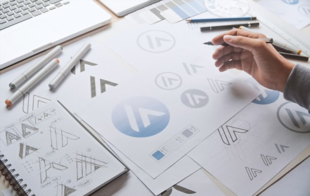
If you want to design it on your own, then the first and the most crucial step of design is sketching. The amount of time it takes to create just one logo might restrict your creativity if you go directly into the computer. Sketching allows you to let your imagination run wild and get several ideas down on paper in a shorter amount of time. Use a computer to fine-tune your logo, and draw to get your thoughts down on paper. Begin with 20-30 drawings or concepts, according to Web Designer Depot, and then branch out to develop variants of the initial ideas. If nothing seems to be working, restart and start sketching fresh ideas. An effective designer will devote the most time to this part of the design process.
Keep Things Simple – KISS
The most crucial step of design is sketching. The amount of time it takes to create just one logo might restrict your creativity if you go directly into the computer. Sketching allows you to let your imagination run wild and get several ideas down on paper in a shorter amount of time. Use a computer to fine-tune your logo, and draw to get your thoughts down on paper. Begin with 20-30 drawings or concepts, according to Web Designer Depot, and then branch out to develop variants of the initial ideas. If no one seems to be working, restart and start sketching fresh ideas. A competent creator will devote the most time to this part of the design process.
Create Color Symmetry
Although color psychology might be complicated, understanding the fundamentals of color can be extremely beneficial to your business. Some of the most important fundamentals to remember are: Avoid using colors that are so brilliant that they are difficult on the eyes.
Neons and bright hues should also be avoided since they tend to fade in smaller sizes. To begin, create your logo in black and white and then pick on colors. It won’t look much better in color if it doesn’t look decent in black and white.
Keep in mind that various colors elicit different feelings and moods, so choose colors that reflect the company’s personality. Various colors indicate various emotions. The BufferApp Blog has a wonderful guide to color emotion.
Typography Matters
Typeface is so important in logo design that it may make or destroy it. Before settling on “the one,” a designer should try out a few dozen typefaces. Experiment with different sizes, spacing, and weights. Use a text maker or similar design tool to really push the limits, or perhaps look for inspiration in existing templates. The typeface should be as complementary to your brand as any other aspect of your logo. If you want to make your firm stand out, be distinctive, and personalize a typeface, fantastic examples of customized logo fonts are Yahoo!, Twitter, and Coca-Cola. When looking for the best logo design company, focus on their previous portfolio to see what type of logos they have designed, especially the typefaces.
Focus on Effects in Editing
Indesign, Photo editing, and other graphic design applications are highly strong tools that provide excellent filters and effects for your logo, but don’t get too carried away! Your logo should not be reliant on these components and should look beautiful even without a fall darkness or transition effect. It’s good to experiment with photo filters, but there’s a time and place for them, and it’s not always on the design of a logo. Of course, seeing whether they can improve your logo is OK, but keep in mind that simplicity is crucial.
Balance Elements that Matter
Because our thoughts are naturally drawn to balance, it is critical that the components of your logo weigh each other.
Here are a some important points to keep in mind:
Affect the size and line widths of each image and typeface. You want a logo that can be scaled to different items, such as official letterhead or site images, therefore aim for a square layout. However the law of balance can be disregarded on occasion, keep in mind that your logo will be seen by the people, not only those with a flair for great art, so a symmetrical layout is the safest bet.
Always Be Original
The last criteria for creating an excellent logo is simple: don’t imitate the work of another designer! There’s nothing wrong with looking at the competition for ideas, but duplicating someone else’s ideas or work is just plain wrong. Being unique also implies that you should never use stock or clipart in your design. As a designer, you should have your own distinct style; this is what sets you apart.